Showing posts with label The Face of the Day. Show all posts

Wednesday, December 24, 2014

my daily 10 minute face

I am not sure if you all have noticed but I haven't been feeling very inspired to do any makeup related posts. This is simply due to me being stuck in a very fixed makeup routine. 2014 is coming to a close and it was very much a year of me trying to use up as much of my makeup collection as possible with very little purchases. That being said, I thought I would show you just what products I have been using for my daily face. It is a quick, simple look that takes less than 10 minutes for me to apply. I stick with a thin base, a matte neutral eye, not much eye liner (shocker, I know), and a sheer lip.

For foundation I have been using Koh Gen Do Aqua Foundation, which I am a fan of. It is pricey but it gives a really nice base that gives decent coverage while looking very skin like and natural. It doesn't cover major blemishes on its own though so for that I go in with my trusty Laura Mercier Secret Camouflage which is something I have been using for quite a while now. For under eye brightening I like the ever popular Maybelline Instant Age Rewind Concealer. This tube is on its last legs and once it is out I plan to repurchase as it really does a nice job at such a cheap price point. To set everything in place I have been using Maybelline Dream Matte Powder dutifully. I smashed up all the stuck product on the pan so I can use every last bit.

My current bronzer of choice has been theBalm Betty-Lou Manizer. This has a bit of a sheen to it but it isn't noticeable if applied sheer. The only makeup product that I actively switch up every few weeks is blush (got to spice it up in here) and currently my choices are Mac Vintage Grape and NARS Gilda. If I am feeling fancy and have some extra time, I will also swirl some MAC Lighscapade underneath my eyes and along my cheekbones to help with the brightening effect.

To start out my eye look I curl my lashes with my Kevyn Aucoin lash curlers. I like how this has a big opening so fitting my lashes into the space is a breeze, but I think the Shu Uemura curlers curl better if I am being honest. Next I apply a wash of Mac Groundwork Paint Pot all over my lid and under my lower lash line. From there I use my Smashbox Filter Eye Shadow Trio. This trio is almost finished you guys, I'm almost done with the mid-brown shade and the biggest hurdle that is left to tackle is the darkest brown. I use a mixture of both shades to apply in my crease and under my lower lash line.

Next I take the dual ended Urban Decay 24/7 liners in Zero and Whiskey. Now if you know my liner rep by now, you know I can't stand Urban Decay's 24/7 liners. For some reason they all smudge and never last on me. But as I mentioned at the start of this post, I am on a "use up everything" mindset so I'm dealing with it. I apply Zero on my upper waterline and then I use Whiskey on the outer portion of my upper lash line, which I then smudge in with my finger. Lastly I give my lashes a single coating of mascara, my current choice being L'Oreal Manga Mascara. I like this mascara, but it isn't my favorite L'Oreal offering.

For lips I either smear a dab of Aquaphor and run out the door or I'll apply a dab of Revlon gloss on my lips and work it in with my fingers. I've been trying to use up Pink Pop and Coral Reef so I switch between the two depending on my mood and blush choice.

Full look with all products mentioned. I applied Revlon Pink Pop on my lips and Mac Vintage Grape on my cheeks. I really like the effect of smudging my liner into my lash line, it makes my lashes appear fuller in an inconspicuous way.

This is what my makeup routine has been like for a good portion of this year. A little boring but seeing all the pan and progress makes me very happy. I also love how quick I am able to do this look since I have been doing it over and over again. I can't wait to be done with these products so I can come up with a new routine to get into.

I hope you all have a Merry Christmas! I plan to do a 2014 favorites post before the year's end so look out for that soon.

Monday, July 14, 2014

current blush rotation: brights

DSC_1796

For me this summer has been all about obnoxiously bright blushes. If you have been a reader of mine for a while, you know I am a huge fan of outrageously pigmented blushes. Yes, they do require some extra time and tenderness when it comes to application, but to me the extra effort is 100% worth it for the effect and longevity. I have been completely uninterested in subtle blush hues and instead very much obsessed with my bright choices. My current blush rotation:

NARS DESIRE
DSC_1828

Surprise, surprise NARS Desire makes the rotation cut. I've professed my love for this blush for ages on my blog so I'll try to keep it short and sweet; a shocking, bright pink that always manages to flatter my warm skin tone no matter the season. Can turn a bit ruddy on some skin tones so it isn't for everyone but I always recommend people to try it on. A staple shade for me.

DSC_1979
Desire in action. MAC Angel on the lips.

CARGO LAGUNA
DSC_1807

Laguna is an extremely underrated blush that NO ONE ever talks about. This is unfortunate as I love this shade. I would say it makes my top ten favorite blushes (a list/post I am scared to do because it will make me confront my blush problem). It looks like a cheeto orange shade in the pan but on the cheeks it sheers out to the most lovely peach shade. This is coming from a gal who has a hard time working peach blushes.

DSC_1931
Laguna in action. Burberry Copper Lip Mist on the lips.

NARS EXHIBIT A
DSC_1815

Lovers of Exhibit A would describe it as cherry tomato red while the more mean spirited might go as far to call this "clown cheeks red". This shade is another favorite of mine. I think this is the scariest blush to look at in the pan which is quite contrary to how it looks on the face. Really great for minimal makeup looks as a light dusting on the cheek bones gives the most natural flush possible.

DSC_1952
Exhibit A in action. NARS Dolce Vita on the lips.

MILANI BELLA ROSA
DSC_1816

If I'm being honest I would have to say that lately Bella Rosa has been my most reached for blush out of all my bright choices. I find myself saying, "Kelly, you really should show some love to your other blushes today" and then next thing I know, I'm reaching for this little pot five days in a row. Such a drugstore gem that shouldn't be overlooked. There are more pictures of this HERE when I gave it its own post.

DSC_1890
Bella Rosa in action. Revlon Pink Pop gloss on the lips.

SWATCHES
DSC_1838
NARS Exhibit A, CARGO Laguna, Milani Bella Rosa, NARS Desire

All shades are matte, which is something I prefer with such strong colors. I use a NARS Yachiyo for application. I have mixed feelings about this brush. It applies pigmented blushes so wonderfully since the tapered shape and flexible handle helps with precise control BUT it sheds on my face like crazy. It is also expensive. If I could turn back time I wouldn't have purchased this due to the shedding. When it reaches the end of its life I plan to invest in the Hakuhodo version.

Wednesday, April 16, 2014

milani flamingo pose

I would say that I have become fairly confident in wearing bold lipstick out in public without feeling self conscious. The main reason I don't regularly wear the stuff is mostly due to the maintenance rather than feelings of doubt. A girl has to eat and drink. Even though I say this, I do get rather nervous when it comes to wearing bold pinks. Remember when I tried my hand at fuchsia (yes I had to look up how to spell this correctly...again)? I don't know what it is about it. Maybe because I have never really been a fan of pink in general or perhaps it reminds me all too much of Barbie.

Either way, I have been determined to try and overcome my bold pink lipstick fear. I tested out the waters with the reddish pink Revlon Strawberry Suede and have come to really love the color. After I got used to that, I picked an outrageously pink color to get the ball rolling: Milani Flamingo Pose.

BAM...just look at that color. It is much brighter in person. It takes me a couple minutes to get used to all that color radiating from my lips. Not for the timid and all for the ones who want to call attention to their lips. It is a pretty color but I still prefer my reds and plums over this.

I have absolutely nothing close to this color. It is an almost neon punchy pink so it isn't surprising that I couldn't find anything similar to what I own. Milani does lipsticks decently. They glide on easily enough and aren't extremely slippy so it won't melt off. They have rich pigmentation and don't excessively accentuate any rough patches. I don't find it to be the most moisturizing but it definitely isn't the driest I've come across. This particular shade leaves a pinkish stain behind once it fades away or even if it is wiped off which I find quite nice. It does have a strong melon scent which I think is too artificial and sickly. I wish it wasn't present but it doesn't linger for the entire wear.

SWATCHES
L to R: Milani Flamingo Pose, Revlon Fuchsia, Estee Lauder Rubellite

All these shades would be beautiful cream blush shades, no? Fuchsia is obviously more of a cool pink with some purple shot through it, Rubellite is almost frosty and more of a tamed ruby.

AWKWARD POSING

So all in all I'm still not used to these punchy bright pink shades, as indicated in my uncomfortable face above. But that doesn't stop me from trying. I wish this shade looked as kick ass on me as it does on Viola but then again she looks good in all damn lipsticks shades, even blue ones. The more I apply it the less shocking the color seems on. Maybe NARS Schiap will be something I'll wear one day. Still terrified.

Wednesday, March 19, 2014

nars gilda

I have a lot of choices when it comes to blush. So much that I tend to neglect many of them. Because of this, I've been trying out a new strategy of plucking 2-3 shades from my drawer and putting them in my daily makeup holder so I can rotate their use for at least a couple months. This helps use up product and it gives me a chance to get to show some love to whatever shades I picked for that rotation. Win win, right?

One of the blushes I currently have in use is NARS Gilda. I actually put this in my rotation to stop myself from buying all of the Final Cut blushes as it seemed along the same lines. I must admit, I rarely reached for this in the past. I was first interested in the shade a few years ago due to BlushingPixie on YouTube. She mentioned it was one of her favorites and every time she wore in in videos it made her complexion look beautiful. So I promptly bought it, tried it on, and wasn't moved by it so it stayed hidden in the back of my row of NARS compacts.

After using it this past month, I have changed my tune. It is really an underrated color. I use a Real Techniques Blush Brush to apply. Gilda isn't crazy pigmented but it also isn't too tame that I need multiple layers. A generous fluff on the brush and sweep across the cheeks and I'm done. Satisfying for fast blush appliers and pigmentation lovers alike.

In the pan the shade is your typical matte peachy pink shade that you can find in any brand. On my skin however, it completely changes and shows not even a hint of pink. It is a very distinct peach. Bizarre. This is probably why I wasn't originally won over with it. I have discovered that my most loved blush shades tend to be neutrals (like CARGO Tonga) or some variation of pink (NARS Desire). Peaches get ignored. I believe this is because I have such a hard time making them work on me. They either make my skin look dirty or are too jarring.

Gilda is a very gentle shade. It is one of those colors that isn't in your face but makes your skin look nicer than it really is. It's nice to finally have a blush that instills some hope in peach blush for me. Maybe I was being too harsh with MAC Melba and Peaches (both shades I own and rarely reach for...because, peach).

NARS Gina is very similar but leans more orange. I do not own it but I do remember going back and forth on which shade to try because they share tones. NARS Amour is also comparable but has more pink in it. I like Amour more than Gilda, unsurprisingly, as it actually shows up as a peachy pink on my skin. Danielle has excellent swatch comparisons of Amour and Gilda if you wanted to see for yourself.

Overall I'm glad I gave Gilda another chance. It is a joy to wear due to its ease and natural effect. Peach lovers will dig it, though you probably have a shade very close to it already. Admittedly, isn't the most unique shade ever made but it is indeed a staple.

SN: Can you believe NARS blushes are $30 USD now?! I remember when they were $25. Sad days ahead when it pushes past $30...

Tuesday, March 4, 2014

urban decay naked 3 palette

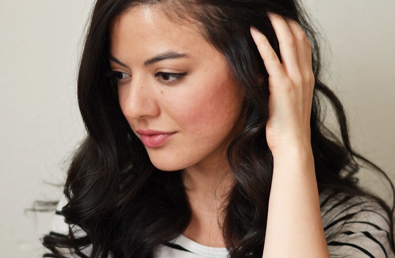
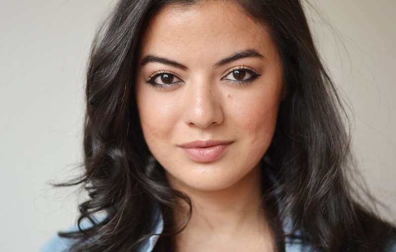
Last month my older sister was gifted the Urban Decay Naked 3 palette from a good friend of hers. What a gem, eh? Being the beauty blogger I am, I took advantage of the situation to test out the much sought after palette for myself. What are older sisters for but for sharing?

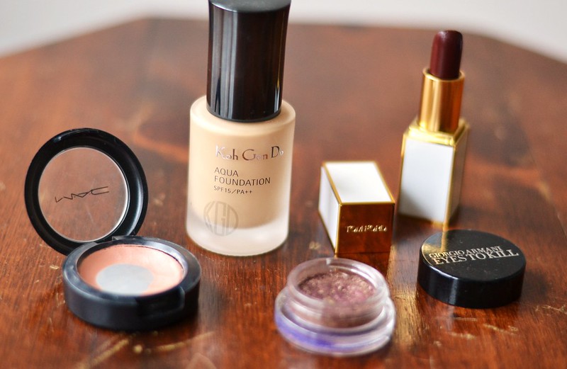
I'll admit, when I first heard and saw promotional material for this palette, I wasn't interested. The first reason being I think Urban Decay is milking their "Naked" range for all its worth and the idea comes across as stale by this point. The second reason I wasn't swayed by the palette was because the shades seemed TOO PINK. All the swatches I saw on other blogs showed mauve and frosty pinks which I don't find particularly flattering on me. Hello inflamed looking eyes! The sturdy, metal package was a nice upgrade though. I'll give credit where credit's due.

With all that grumpy negativity aside, I still gave this palette a fair and square shot by starting off neutral. I was determined to consistently try out different looks for a full month using only this palette to see how I felt about it. After a month's use, I have mixed feelings. I discovered some shades I really enjoyed while others left more to be desired.

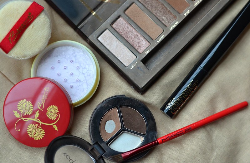
URBAN DECAY NAKED 3 PALETTE

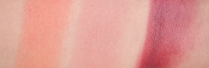
URBAN DECAY NAKED 3 SWATCHES
FROM L to R: Strange, Dust, Burnout, Limit, Buzz, Trick, Nooner, Liar, Factory, Mugshot, Darkside, Blackheart

STRANGE: One of those invaluable, MAC Brule-like shades. I enjoyed this. I liked using it all over my lid to blank it out and make other colors show up and apply much richer.

DUST: Urban Decay always has to include at least one glittery shade in their palettes and for Naked 3, Dust is one of them. Rarely used this due to the glitter but when I did, I either dabbed it in my inner corners or patted it lightly over the center of my lid on top of a more subdued shade, just to emphasize the shimmer.

BURNOUT: Similar to MAC All That Glitters which I am actually not a huge fan of. Nonetheless, I know people go crazy for shades like these so it is bound to be a hit for most. I rarely used this as I find shimmery pinks like this make me look funny. Washed out? Surprised when I'm not? Hmmm I'm not sure how to explain it .

LIMIT: One of my most used shades, as it is a matte transition shade. It is a light mauve that takes quite a bit of layering to even show up to the party. If it wasn't one of the crucial shades in the palette, I wouldn't have even bothered using it. Alas, colors needed to be blended out so I had to use it. Also, if used alone without the help of Nooner, it made my eyes look inflamed. Darn pinks.

BUZZ: Another glitter shade. I used this the same way as I did Dust.

TRICK: By far the worst shade in the palette. Looks terrible on me, which I proved in a look below. I have yet to find out how to use this shade properly to make it work. Inner corner highlight?

NOONER: Another essential transition shade. I liked this one better than Limit as it doesn't make my eyes look like I had an allergy attack. Still, I prefer my transition shades to be more of a mid-toned brown like MAC Cork or Wedge, but this was a nice change. I combined it often with Limit in the crease for a simple daily look.

LIAR: Easily my favorite shade in the palette. Duh, it's a taupe (my favorite eye shadow color to wear) so you shouldn't be surprised. Reminds me a bit of Urban Decay Toasted which is one of my favorite eye shadows of all time. It swatches frostier than how it applies on the eye. It's one of those shades that becomes softer and more complex as you blend it out. Very easy to use for a one eye shadow only look. My most used after the transitional matte shades.

FACTORY: Another taupe so I enjoyed it. I didn't use it all over the lid though, it was too dark for that use and it didn't blend out into a softer color. What you swatch is what you get. Deepening the outer V was a good job for it.

MUGSHOT: Yet another taupe, but plummier and cool toned. Of course I liked it, noticing a trend here? I used this more for smudging out my lower lash line as it did a spectacular job at it. Quite a cool taupe, so I didn't use it all over the lid (Cool taupes make me look tired).

DARKSIDE: I actually used this shade often. When my eye looks were turning toward pink-inflamed-why-God-why territory, I blended a little bit of this over it and it made things bearable. Also excellent at deepening the outer V or smoking things out. It looks scarier in the pan than when actually used on the eye.

BLACKHEART: I feel like this is what most expected MAC Beauty Mark to be. Blackened base with purple shimmers, but the shimmers actually stick around when you apply it instead of disappearing like Beauty Marked. Good to have a very dark shade like this in a palette. It helps with smokier looks and you can use it as an eyeliner. Some days when I wanted a more natural look, I skipped eye liner and instead smudged this on my upper lash line. Nice effect. Especially helps that it is a easy to blend shade.

ORIGINAL NAKED PALETTE

L to R: Virgin, Sin, Naked, Sidecar, Buck, Half Baked, Smog, Darkhorse, Toasted, Hustle, Creep, Gunmetal

I thought I'd include the original Naked palette in case you wanted to compare. I do enjoy the original, it contains many shades I would pick myself for a palette besides Half Baked and Sin. I have given it quite a bit of love since its first release.

Look at the REAL transition matte shades: Naked and Buck. My favorites. Also, Gunmetal is the king of making brown eyes stand out in smoky eye looks. It is my go to smokey eye shade that I pair up with Creep. And I already mentioned Toasted is a very pleasurable shade to wear. If I used it up I'd buy the single, if that gives you an idea of my love for it.
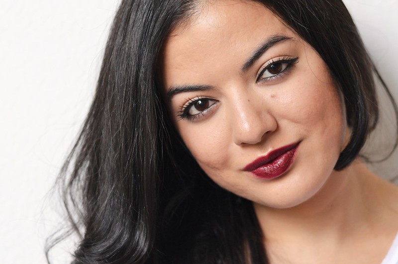
IT'S TRICKY

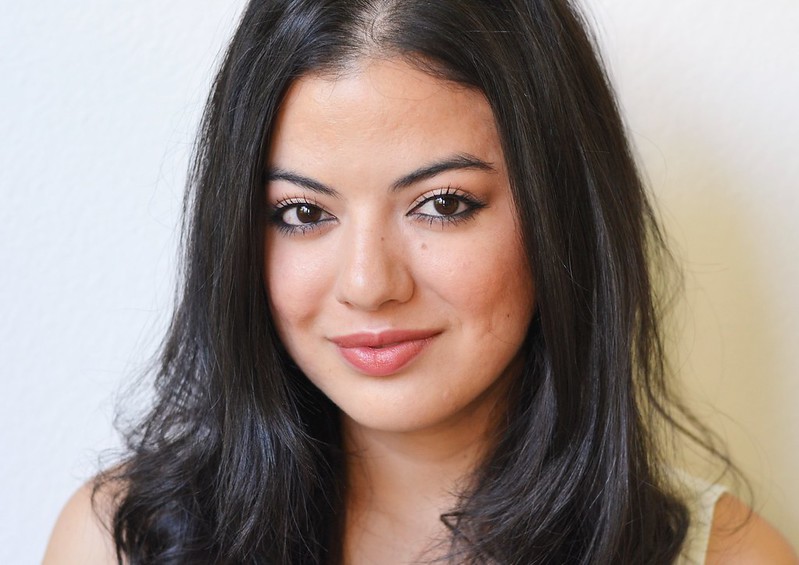
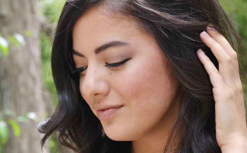
Here we have a look with Trick all over the lid, a mixture of Limit and Nooner to blend into the crease, and Darkside to deepen the outer V. Blackheart was used as a liner, smudge into the outer half of my upper lid.

Ugh I did not like this look and I blame it entirely on Trick. Such a weird shade, I didn't know what to do with it but I took photo proof of it for you guys. SO THERE.
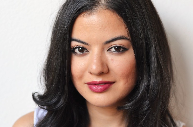
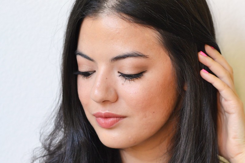
SOFT CREASE

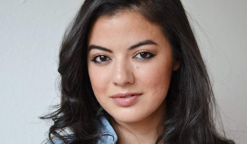
My daily look for about 2/3 of the whole month. Easy, fast, and looks like barely there makeup. Strange all over the lid to blank, mixture of Limit and Nooner in the crease, Mugshot blended into the lower lashline. Add a simple flick of some liquid liner and a quick coating of the lashes and I'm out the door.

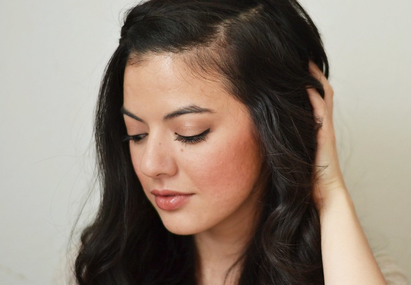
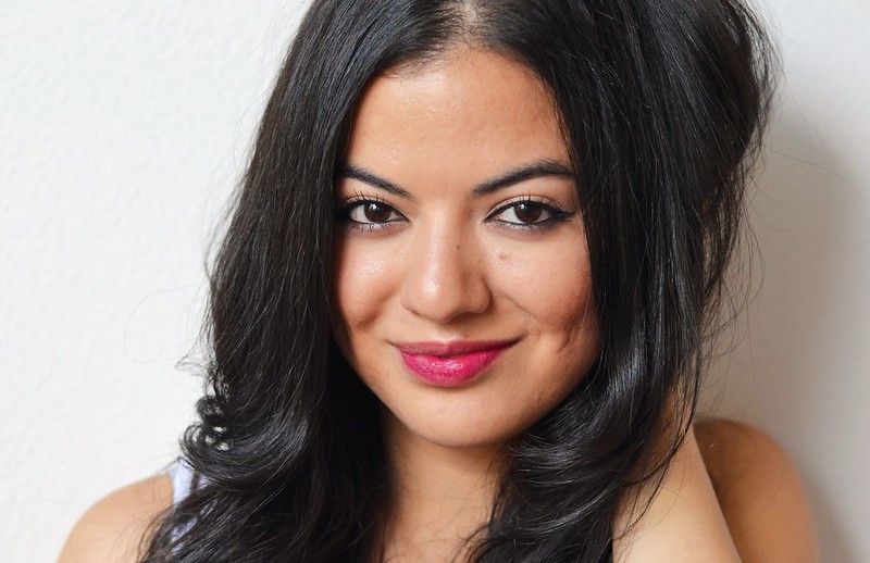
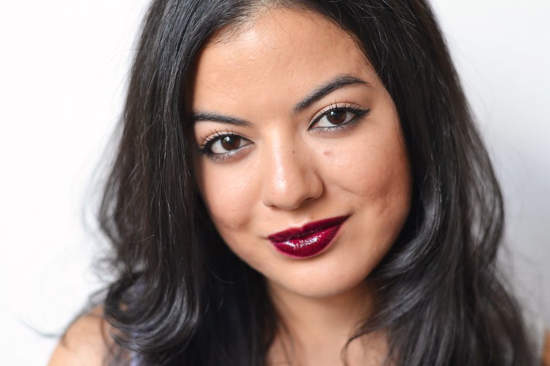
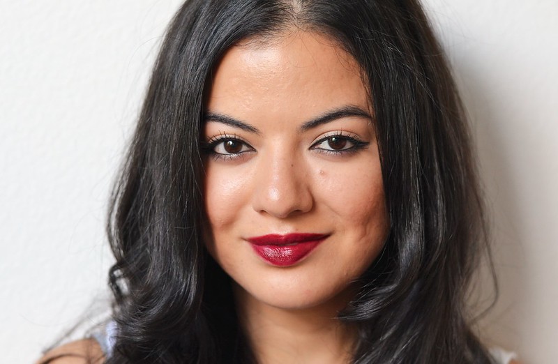
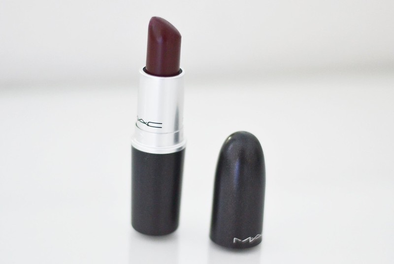
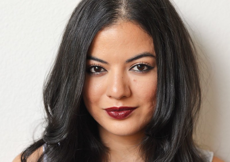
On an unrelated note, Burberry Copper Lip Mist FTW! That's what I'm wearing in this look, if you were wondering. It's a staple lip color.
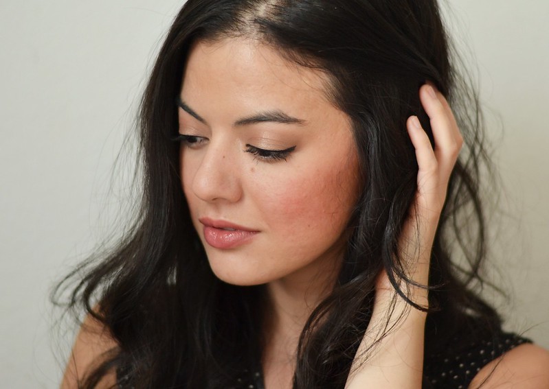
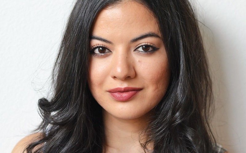
TAUPE, OF COURSE

Ahh this is more my territory. Liar all over the lid, little bit of Nooner to transition, Factory to deepen the outer V, and Mugshot smudged under the lower lash line. See how different Liar ends up looking so complex blended all over the lid? I won't say I told you so. More liquid liner with copious amounts of kohl liner to the lower waterline. My signature look.

OVERALL:
I don't think this is a terrible palette. The textures and blendability are of fine quality like Urban Decay's standard. Pigmentation isn't an issue if you don't count Limit since it needs extra layers to show up. The colors are neutral so you have many options to work with to make countless looks. You can be glittery, you can be smokey, you can be natural, etc. Some of the shades are real stunners, like Liar. Others are invaluable such as Strange, Blackheart, and Nooner.

However, I don't think this will suit everyone's tastes. I definitely don't think it is worth $52 USD since not all shades are universally flattering. Make sure you find the two mauvy transition shades to your liking or else you will have to reach for better options from your stash which defeats the purpose of an eye shadow palette. Also, most of the left side of the palette screams PINK so if those types of shades tend to make your eyes look inflamed or irritated, this won't be a great choice.

For an alternative perspective, my older sister loves this palette and every look she has done with it looks great on her. She has a browner complexion than me and her favorite shades to wear are mauves so this color palette definitely fits her tastes. I have tried replicating the same looks she does and they don't turn out quite as nicely or flattering. To each their own...

Tuesday, November 26, 2013

current blush rotation

*This post contains one item provided by an outside company for trial.

DSC_0536

As a self proclaimed blush fiend, it is rare for me to stick to one blush a day and call it good. I tend to crave a different shade, finish, and brand depending on on my outfit that day, how much time I have, or even what type of mood I am in. Despite this, I recently realized I have been rotating through the same set of blushes for over a month. Since a blush routine is very rare for me, I figured it deserved a dedicated blog post. My current "blush mood", as we can call it, has been all about easy, natural colors.

Cailyn Peach Pink
DSC_0634

First up is *Cailyn Deluxe Mineral Pressed Peach Pink Blush. I recieved this as part of the Wantable subscription box that was sent to me (first mentioned in THIS post). To be honest I had zero expectations when I first laid eyes on this product. It looked like your typical, nondescriptive blush shade that you can find in every makeup line. But then I went ahead and applied it to my cheeks and I had to reprimand myself for being so quick to judge. This blush is really fantastic. I'm talking, I made my sister try it on to make sure it looked just as flattering fantastic (it did). It has just the right amount of pigment so the blush pros won't scoff at it and the blush novices won't give themselves clown cheeks.

This color is self described as a "Peach Pink" but on me it leans more peach. I have quite a hard time making peach blushes work for me which is why I think I was wary to begin with when I saw the color in the pan. Peaches usually end up too dirty on me (MAC Melba) or too orange (MAC Peaches). This shade instilled some peach blush hope for me, I thought they would never flatter my skin tone.

The only gripe I have about this product is that is it heavily scented, a bit like grandma. Luckily it doesn't stick around but it is still a bit bothersome.

CARGO Tonga
CargoTonga

Hopefully I don't have to talk much more about CARGO Tonga as I just blogged about it and it has its very own review post. To summarize, one of my favorite blushes to date. Although it looks very boring in the pan it goes with any look, buffs into the skin wonderfully, and the color is very uplifting. Highly recommend it.

Bobbi Brown Velvet Plum

IMG_2979

You get a shoddy iPhone 4 picture to showcase this one! If you have been following me for a while you know my love for Bobbi Brown's Pot Rouges. They come in a nice variety of colors, the texture isnt greasy or too tacky, and the lasting power is great. I have been reaching for Bobbi Brown Velvelt Plum (in the old packaging) when I feel like using cream blush and to give a nice rosy grape cheek. No such thing as a rosy grape, but just go with it. Unfortunately this color is discontinued (!?!?)

SWATCHES
DSC_0526
FROM LEFT TO RIGHT: CAILYN PEACH PINK, CARGO TONGA, BOBBI BROWN VELVET PLUM

Not your typical fall shades but I can't seem to get out of this rotation. Really into the natural cheek at the moment. What is in your blush rotation currently?

++ Wantable sent the Cailyn blush to me free as part of their subscription box. This post does NOT have any affiliate links

Wednesday, November 6, 2013

skip to my lou

**This post contains one item provided by an outside company for trial.

While applying makeup the other day I came to the realization that I skip quite a few steps that some may think are crucial to their routine. Why? Well for one thing, TIME. For my everyday look I am all about lessening the time it takes for me to slap on makeup so I can get out the door quick. For the other, I don't think actually carrying out these applications makes a huge difference to my overall look. They are small details or extras that I would do if I wanted to perfect my look but for everyday they feel unnecessary. What doesn't make the cut in my daily routine?

DSC_0642

BROWS
I'll start off with probably the most shocking for some, my brows. On a daily basis I do nothing with my brows. I am fortunate enough where the hair of my brows are thick and coarse enough to make their appearance known. Once in a blue moon I'll fill them in with a MAC 266 brush and a dark brown shadow, like the one in this Smashbox trio in Filter, to emphasize them (or to sneakily use up product).

UNDER EYE SETTING
I don't normally use any special setting powder for my under eye area, which some do to give some extra lasting power to their concealer or to brighten up the area. Swirl and go is my philosophy! But if I am feeling fancy I'll gently buff in *Besame Brightening Violet Powder underneath my eyes to set my concealer. I received this item as part of a Wantable box which I'm sure most of you have heard about from other bloggers by now (check out Makeup Magpie, Beauty Reductionista, and Perilously Pale to get an idea about the company). Basically it is one of those subscription box deals but they give you full sized products from brands that aren't mainstream which I find refreshing.

Back to the powder, it really is very good. Light texture, softly brightens skin, and doesn't have any weird scent. Plus, isn't the packaging all quaint and neat? I had never heard of the company before so I relied on my good friend Google to see what it was about. I think vintage makeup lovers would really dig it. They have cake mascara for crying out loud. How intriguing is that?!

INNER EYE/BROW HIGHLIGHT
Maybe I have just been using lackluster products for this but I just do not bother with this step on a daily basis. I appreciate it when I am going out or for special occasions but I think overall the effect is so subtle that I don't miss it when I skip out on it. When I do make the effort I usually use something like Bare Minerals Nude Beach for taupe looks and the more universal Urban Decay Virgin for neutral looks.

FULL EYELINER
I flip flop on this depending on my mood. I would say most of the time I do not fully line my top eyelids. Instead I start my liner of choice, L'Oreal Lineur Intense normally, in the middle of my lid and wing it out to the outer end. Not only does it save time, but it makes my peepers look more open and awake. Don't get me wrong, I love the full on Egyptian eyes but for everyday the half-way application is my go to for a natural look.

IN ACTION
DSC_0633
LEFT SIDE has all the mentioned products applied; RIGHT SIDE is my "daily" look

Can you tell the difference? The left side I filled in my brows, fully lined my lid, added brow and inner corner highlight, and buffed in brightening powder under my eyes. The right side you can see my brow is subtly less filled, my under eye area is a little less bright as are my brow bone and inner eye, and my eyes seem a bit more open. It is subtle but if you look at the details you can spot it!

For my daily look, I don't mind skipping some extra steps. It may not perfect my overall look but I don't mind. I just want to look semi put together before leaving the house. Do you cut out any steps in your routine? I have read some people skip out on blush and that horrifies/baffles the blush fiend in me, but to each their own...

If you were curious:

Face: THIS MIX for my base, Laura Mercier Secret Camouflage, Revlon Photo Ready Concealer, Nars Light Reflecting Setting Powder, Stila Bronzer #2, MAC Hush CCB, blush will be mentioned in an upcoming post

Eyes: Burberry Pale Barley, Smashbox Filter trio, L'Oreal Lineur Intense, Giorgio Armani waterproof liner, L'Oreal Voluminous

Lips: NARS Dolce Vita lipstick

++ Wantable sent the Besame Brightening Powder to me free as part of their subscription box. This post does NOT have any affiliate links.

Thursday, October 31, 2013

hands on

For the past week I have picked up on a little habit: using my very own hands for a few steps of my makeup application. Is this taboo in the makeup world? I'm not sure. I feel a little guilty doing it as it doesn't feel like the most sanitary action. But as I am not a germaphobe (I am very anti hand sanitizer), I don't feel as if I am committing a huge faux paux. Sometimes your own paws yield surprisingly great results!

DSC_0609

I think the last time I applied foundation with my fingers was back in high school when makeup brushes were unknown in my world. Lately I have been really enjoying the finish Koh Gen Do Aqua Foundation gives my skin when applied with clean hands. The warmth from the skin really makes the product melt in seamlessly, especially with the thin, watery formula this foundation has.

I'm still applying my blush and powder with a brush, but for highlighter I have been diligently using up MAC Hush Cream Color Base. I am determined to finish this up! I really love this product and would consider repurchasing it. The best application is with a few taps of my ring finger atop the highest points of my face.

For eyes I have been reaching for Giorgio Armani Eyes to Kill #28, an interesting mix of bronze and aubergine. It has the ability to be quite shiny and metallic when applied with a brush. When applied with my pointer finger, however, it tones down to a natural haze of bronze with less shimmer. I like me a versatile product!

For lips, I'm still stuck on using vampy lipsticks as stains. I tap the product straight from the bullet on the lips and then I gently press the pigment in to even things out before it sets. Tom Ford Black Orchid has been my latest pick for this, I talked more in detail about the shade HERE.

HANDS ON LOOK
DSC_0563

I'm wearing NARS Sin blush here. Remember that shade? Man what a staple. Every time I decide to use it I fall in love with it all over again. One of my top NARS shades for sure. Gives such a nice flush to the skin without looking dirty or bruised. The lasting power is phenomenal.

What do you think of using your hands for makeup application? Does it bother you or do you prefer it? This no tools look is easy to rely on, it is easier, faster, and my favorite aspect, less makeup brush cleaning! Makeup brush cleaning is the worst...

Saturday, September 28, 2013

dark vampy lips day 5: YSL violet edition (#01)

It is the final day of my dark vampy lips series! I saved quite an intense shade for last: YSL Violet Edition (#01) Glossy Stain. This is not a shade for the fainthearted; it is deep, dark, and very eye catching.

YSLGlossyStainNo1

Violet Edition comes in a luxurious gold and black packaging with a window teasing the color of the stain. The applicator is pointed which is something I appreciate as it makes applying the intense pigment more precisely. Before application, the product looks resolutely purple. I'm talking Barney purple. However, once applied to the lips and dried it changes into a darker violet, as you will see below.

WORN AS A STAIN
YSL1stain

Surprisingly I enjoy the look of this as a stain. I say surprisingly because it looks like a bright fuchsia. Even though I enjoy how it looks, this particular color stains very unevenly. You can see that my bottom lip is much more saturated than my top lip. I have also noticed the stain makes my lips feel dry, but I have come to the conclusion that lip stains are inevitably drying and need to be paired with balm.

APPLIED WITH TWO COATS
yslglossy1

The glossy stains are beautiful but I do think it depends on what shade you pick on the performance of the product. I have this shade as well as Rouge Laque (#09). Rouge Laque blows Violet Edition out of the park when it comes to application and finish. Violet Edition applies patchy even when two coats are used. I have heard this is remedied if you use a dark lip liner. I refuse to go out and buy another product with this to make it work so I just deal with it.

My method of application is applying a thin layer all over the lips, let it dry for a few minutes, and then add another coat on top. I let that dry and go back over the streaky parts to make it all mesh together. Annoying, but the color is so crazy awesome and the texture of these feel neat: squishy yet not sticky. If you are a die hard vampy lips lover, I think you would swoon over this.

SWATCHES
BerryLipSwatchesFROM LEFT TO RIGHT: Tom Ford Black Orchid, Revlon Wine Not, MAC Media, Revlon Plum, YSL Violet Edition

I like Violet Edition, but the nature of the intense color makes application streaky. It doesn't deter me from buying any other glossy stains though since I know they have the potential to be really something (Rouge Laque applies wonderfully).

Do you have any glossy stains? Is Violet Edition too intense of a color for you? I hope you enjoyed this series and were inspired to pull out your vampy shades for the fall season!

Friday, September 27, 2013

dark vampy lips day 4: revlon colorburst in plum

Day 4 of dark vampy lips has crept upon us and today I have another lipstick from Revlon and yet again it is a discontinued item: Revlon Colorburst Lipstick in Plum. Another line that Revlon got rid of but you can still find some shades floating around discount stores and online retailers. I purchased this back when they were readily available in drugstores.

RevlonColorburstPlum

Plum is encased in a fancy quilted black packaging with a color coded cap. The shade in the bullet looks redder than expected. It has an almost cinnamon color to it. There are a few tiny sparkles if you look closely but it doesn't make much of an appearance on the lips.

WORN AS A STAIN
RevlonPlumstain

Strangely enough when this is worn as a stain, it looks a bit magenta. This is another deep shade that I rarely ever wear as a stain since I think the full opacity looks more flattering on me.

WORN FULLY APPLIED
RevlonPlum

Applied full on the plum is more apparent. The ColorBurst line has a bit of shine to it. It applies nicely and easy enough. I think the ColorBurst line tends to feel drying after a couple hours of wear which is surprising since it looks glistening when first applied.

SWATCHES
BerryLipSwatches
FROM LEFT TO RIGHT: Tom Ford Black Orchid, Revlon Wine Not, MAC Media, Revlon Plum. The last shade will be revealed in the next post!

The ColorBurst line isn't my favorite formula of lipsticks due to it being drying during wear so I am not too heartbroken to see them discontinued. However, I really enjoy the color of Revlon's Plum. I tend to whip it out every Fall as it isn't too dark to be dramatic but it still has a nice vampy feel.

What do you think of Revlon Colorburst lipstick in Plum? Am I the only one that found this line of lipsticks to be a bit drying?

Wednesday, September 25, 2013

dark vampy lips day 3: MAC media

We have made it to Wednesday meaning this vampy lipstick series has reached its halfway point. Have you enjoyed it so far? Hopefully you haven't decided I am clinically insane for owning what seems like the same color in each post. If you have indeed confirmed my questionable state of mind, humor me anyway by reading up on today's dark contender: MAC Media.

MACMediaSatin

In the bullet Media looks like the usual almost black cherry hue that vampy lipsticks tend to have. Poor Media, I bet it gets ignored all the time at MAC counters since most probably assume it is a Gothic black color.

WORN AS A STAIN
MACMediastain

As a stain, this lipstick shows a distinct fuchsia base. Remember how scary I though fuchsia was? Well that hasn't changed. I rarely wear this as a stain since the pink in it makes me feel a little funny. Still, it is better than flat out fuchsia due to the berry in it. Imagine this on pale skin! It'd be wonderful. Perhaps I should try it out when I get bone white in the dead of winter.

APPLIED FULLY
MACMedia

Full opacity is my preferred way to wear this. The deep boysenberry is much more in my comfort zone. Media is considered a satin finish by MAC's categorization; not quite matte but not quite shiny either. I'd say I agree with that description. I enjoy MAC's lipsticks. They smell nice, apply easily, and feel comfortable and non drying on the lips. Doesn't hurt that their color range is insanely huge so your options are completely open.

SWATCHES
BerryLipSwatchesLEFT TO RIGHT: TOM FORD BLACK ORCHID, REVLON WINE NOT, MAC MEDIA. The rest will be revealed as the series continues.

Media shouldn't be overlooked at the counter. Swatch it out sometime! Especially if you like fuchsia stains, this would last you forever. I have heard Revlon Black Cherry is a pretty similar to this if you find MAC to be out of your price range.

What do you think of MAC Media? I have always wondered why they named this Media. Whoever has the job of naming MAC products must have a ball.

Tuesday, September 24, 2013

dark vampy lips day 2: revlon wine not

It is day 2 of dark vampy lips week, what do I have to show you? It is Revlon Matte Lipstick in Wine Not, a really wonderful hue that I recently found lurking around in a Big Lots as it seems Revlon has annoyingly discontinued most of the matte line. I did hear a murmuring of them coming out with a new line soon named ColorBurst Matte Balms which sounds extremely exciting. Perhaps that will make up for them phasing out the good stuff.

RevlonWineNotMatte

Back to Wine Not: it is a beautiful dark Merlot shade. The formula is of course wonderful, I've talked about my love for the bolder shades in Revlon's Matte line already. They always go on smooth and effortlessly without sacrificing rich pigmentation. The more I use matte lipsticks the more I think I prefer the finish compared to those with a sheen. It is somewhat less distracting and more focused on the color when things are matte. Or perhaps I am just going through a matte phase.

WORN AS A STAIN
RevlonWineNotstain

I have been absolutely obsessed with this lipstick as a stain. I have worn it this way for the past week. It is so easy and it has been fitting my mood with the changing weather. As a stain it appears as a deep raspberry shade.

APPLIED FULLY
RevlonWineNot

When applied full blast you can see how it is a red based vamp. Wine Not is a really fitting name for it as it does look like a nice glass of the fermented stuff. As always, prepping the lips is a given. I think dry lipped people might have comfort issues with this. I have pretty normal lips and towards the end of the day with this on I start to feel dryness. Initial application and a few hours of wear is a breeze though.

SWATCHES
BerryLipSwatchesLEFT TO RIGHT: Tom Ford Black Orchid, Revlon Wine Not. The rest will be revealed as the series continues.

Wine Not is a discontinued color but you can still find it over at All Cosmetics Wholesale. Not an affiliate link, just trying to help a fellow deep wine lipstick lover out! I recommend it if you have normal lips. Dry lips beware, but then again the lipstick is cheap as chips so perhaps that is a bit of a dramatic warning.

What do you think of Wine Not? I should be asking what your favorite type if wine is instead, I have a feeling that might get more fun answers...

Monday, September 23, 2013

dark vampy lips day 1: tom ford black orchid

While rummaging through my lipsticks I noticed that I have a nice handful of deep vamp shades. I thought it would be fun to do a vampy lipstick series where I will post for 5 days on the shades I have. Deep berries have always had a special place in my heart. They were the first type of bolder lipsticks that I felt comfortable enough to wear out in public which sounds a bit strange since they can look very dramatic on. I think my comfort stems from me liking the contrast they have against my dark hair. To start off the series with some luxury, I picked Tom Ford Black Orchid.

TomFordBlackOrchid

Black Orchid is an intensely dark burgundy. It appears as a very dark purple in the tube so I was surprised to swatch this and see a reddish brown quality to it. It is still gorgeous, pigmented, and EXPENSIVE. A tube will cost you $49 USD. I was lucky enough to spot this in a Sak's off Fifth for around $35.

One of the things I love most about dark lipsticks is they work beautifully on their own and also as a stain. It can give a completely different and less dramatic look by simply tapping on the lipstick lightly on the lips and then adding a clear balm on top to smooth things over.

WORN AS A STAIN
TFblackorchidstain

As a stain, Black Orchid shows it base color to be a reddish plum. The color looks really soft and flattering on. It is very wearable and nothing too dramatic. I love stains, not as much hassle to touch up or upkeep the color.

WORN FULLY APPLIED
TFblackorchid2

When applied to its full opacity, the richness of the burgundy is apparent. It is very dark and bold. There is a bit of a shine to this formula. As it is such a deeper color, it can be unforgiving if applied to dry, patchy lips so I always prep with Nuxe Reve de Miel.

TFblackorchid

If you are a fan of Tom Ford's lipstick formula and love a good deep berry, Black Orchid would be something to look into. I would act fast if you are interested though; I have heard this shade is being discontinued. You can still find it at the Sak's website still so I'm guessing they are selling it until their stock is gone. Nordstrom's website no longer lists it.

SWATCHES
BerryLipSwatches
Black Orchid is the farthest to the left. The rest of the swatches will be revealed as we continue out the series.

What do you think of Black Orchid? I was surprised to hear of it being discontinued as I thought it was a pretty coveted color! Perhaps it was a bit too runway and dramatic for the general public...

Thursday, August 22, 2013

review: shiseido sun protection liquid foundation

For the last couple months I have been trying out the Shiseido Sun Protection Liquid Foundation. Let me start off by saying I feel bad at the timing of this post since this product is technically a more "summer" product. But hopefully this is a helpful resource for next summer, those who live in perpetual hot weather, or those who just appreciate having a high SPF foundation.

DSC_0203

This is a liquid foundation that claims to protect against UV rays while having full coverage that glides on smoothly and evenly with no stickiness. It should resist perspiration, water, and oil, while maintaining a matte look on the skin, even during outdoor activities. It comes in a small, palm sized turquoise plastic bottle. The packaging has no pump but it does have a small plastic spout to release the product with more control.

WORN ALONE
DSC_0170

This foundation has a very watery, thin consistency making me prefer using my fingers with this foundation. It melds better into the skin that way and less product is wasted. I have applied with a Real Techniques Buffing Brush but I think too much product gets soaked up and lost in the bristles. The product also comes with a thin, rectangular sponge but I have never used it. I'm guessing this would apply beautifully with the Beauty Blender due to the thin texture, but I do not own one to know for sure.

CLOSER LOOK
DSC_0164

Coverage is controllable. You can apply a thin layer for something very light or you can add more for heavier coverage. It is very lightweight and blends in smoothly so even if you piled on the layers, it doesn't feel heavy on the skin. Even so, I think this is a more medium coverage foundation since some blemishes I have still need some help with concealer. The finish is matte.

FULL FACE
DSC_0186

I have worn this during a few different scenarios. Starting with the most extreme: Southern summer heat. I wore this all throughout my Bonnaroo trip back in June which took place in Tennessee. I found this protected against the sun really great since I never saw damage or got sunburned on my face. However, I did sweat profusely during the insane heat and when I gently pressed the sweat off, I noticed it transferred. But the overall coverage stuck around on my face.

The next scenario is less extreme but still has some hardiness: Midwestern summer day at the beach. I spoke a little bit about this in my beach day post, but I'll give another basic rundown. I wore this for a beach day and did not notice any transferring. I also swam with this on and it still stuck around, albeit with some expected fading. I did not get sunburned wearing this.

CLOSER LOOK
DSC_0183

Finally, the mildest scenario: a normal Midwestern summer day. I find this stays matte until around the 4 hour mark on my oily skin. Once I blot, my makeup still looks fresh and the same as when I first applied it. This foundation does not budge, even when worn all day. Removal with an oil cleanser is recommended in the packaging of this product and I agree. If you don't use an oil cleanser, a really thorough one will be needed to get everything off. Plus due to the high SPF, you should be more thorough in your removal regardless.

SWATCHES
DSC_0222FROM LEFT TO RIGHT: SHISEIDO SP-50, LANCOME TEINT IDOLE ULTRA 260 BISQUE N, YSL TEINT RESIST #6, KOH GEN DO AQUA OC-2

This foundation retails for $35 USD. I purchased mine at Macy's. The shade I got matched to was SP-50 which is the third darkest in the line. I purchased this early in this summer so now it is a bit too light for me. I think the shade range for this foundation is terrible. There are 7 measly shades and they cater to the light and cool skinned.

OVERALL:
So do I like this foundation? I think it is decent. It applies and blends in the skin very easily which I appreciate. I like the control of the coverage and how lightweight the formula is. I do not like matte finish foundations which this unfortunately is. Sometimes I don't even powder because it doesn't need it. But I do think it protects excellently against the sun and incorporates the SPF into the formula well which was the main reason why I bought it. I was also disappointed in its lack of oil control since I got pretty shiny around the 4 hour mark. There is also a limited amount of shades.

I WOULD recommend this foundation IF:

+ You have normal to dry skin. Or if you are oily yet don't mind blotting frequently
+ You are looking for a foundation with great sun protection
+ You prefer a matte finish
+ You live in a moderately hot territory and want something water/sweat resistant

I WOULD NOT recommend this foundation IF:

+ You have oily skin
+ You prefer a dewy or satin finish
+ You live in insane, sweaty weather.

As for the rest of my face:

FACE: Shiseido foundation, Chanel Soleil Tan de Chanel, Laura Mercier Secret Camouflage, Maybelline Brightener Concealer, Dior Lifting Concealer, NARS Light Reflecting Pressed Setting Powder, Milani Luminoso, MAC Hush

EYES: Burberry Pale Barley, Smashbox Filter Trio, L'Oreal Lineur Intense, Urban Decay Zero on waterline, Prestige My Blackest Lashes

LIPS: Clinique Mega Melon Chubby Stick

Friday, August 9, 2013

failproof favorites

Ever since I can remember, favorites have been difficult for me. When people ask, "What's your favorite song?" or "What's your favorite color?" or even "What is your favorite food?" I am at a loss at what to respond with since I love variety and my tastes expand across all different genres. This is no different when it comes to beauty products. That's why when I declare something to be my favorite, it is a pretty big deal.

I wanted to focus today's post on a couple products I used recently that made me realize just how much I love them. I'm talking I-want-these-in-my-makeup-stash-at-all-times love. They never disappoint whenever I use them and always look flattering on me.

THE GEMS
DSC_9784

NARS DESIRE BLUSH
This looks completely scary and intimidating in the pan. But trust me when I say that when worn sheerly and applied lightly, it is absolutely stunning. The texture is dry and the finish is matte so a fluffy brush works best with this. The lasting power is outstanding; I will apply this in the beginning of my day and have minimal fading by the time of removal. I have nothing bad to say about this blush but I do have a word of caution: I don't think it suits everyone. It is such a shocking pink shade that I think it potentially could make some golden skintones look ruddy and red instead of freshly flushed. I would definitely try this on in person before purchasing.

MAC SABLE EYE SHADOW
While I don't think MAC makes the best eye shadows on the market, no one can deny they have probably the most extensive variety of colors. I think everyone who initially comes across MAC in store is awestruck/overwhelmed by the rows upon rows of shades available. This is one of the gems in those rows. Sable is a shimmering plummy bronze. I tend to wear this shade when I know I am going to special events or if I am being photographed. I would consider it a neutral with a twist since the plumminess adds a little something extra without being too loud or colorful. It looks wonderful on brown eyes.

SWATCHES
DSC_9815 IN ACTION
DSC_9801

DSC_9795

These are my security blanket products. When all else fails, I know these products won't. Desire is actually a product my older sister loves and declared recently that she never wants to be without it. Now that is some serious love. What are your failproof favorites?